|
|
19. MS Excel data
and graphing instructionsÓ |
|
|
Lawrence W. Braile, Professor
Department of Earth and Atmospheric Sciences Purdue University West Lafayette, Indiana Sheryl J. Braile, Teacher Happy Hollow School West Lafayette, Indiana February
4, 2002 |

Objective: This module provides instructions for using the MS Excel program to save, organize and graph data that are derived from SeisVolE analysis of earthquake and volcano activity. Four main types of graphs are illustrated: histograms (or bar graphs), X-Y scatter plots, “event” plots, and bubble plots. Examples using data from SeisVolE analyses and exploration are provided.
![]()
|
|
|
|
|
|
|
|
|
|
|
|

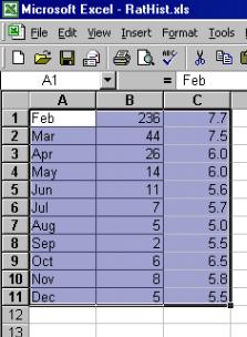
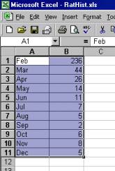
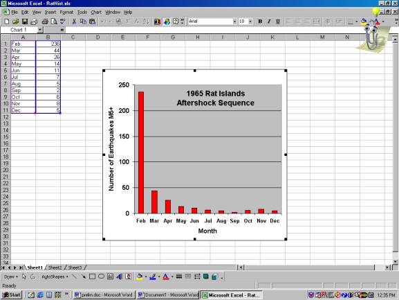
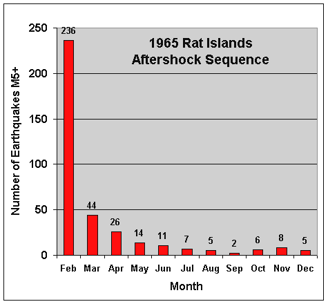
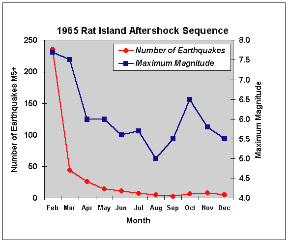 Figure
19.5. Aftershock sequence for the February 3,
1965 Rat Island earthquake. The number
of aftershocks per month is shown by the red circles. The maximum magnitude of the aftershocks for each month is shown
by the blue squares.
Figure
19.5. Aftershock sequence for the February 3,
1965 Rat Island earthquake. The number
of aftershocks per month is shown by the red circles. The maximum magnitude of the aftershocks for each month is shown
by the blue squares.
![]()
|
|
|
|
|
|
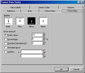
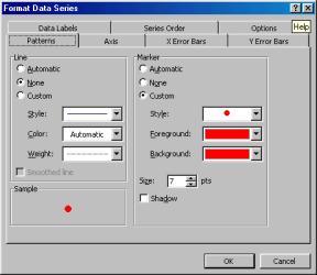
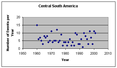
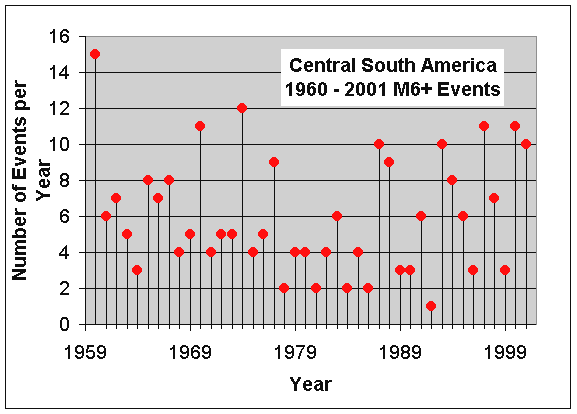 Figure 19.8.
Event plot of central South American earthquakes by year. Selected area was 4.9 – 32 degrees South
latitude, 55 – 88 degrees West longitude.
Figure 19.8.
Event plot of central South American earthquakes by year. Selected area was 4.9 – 32 degrees South
latitude, 55 – 88 degrees West longitude.
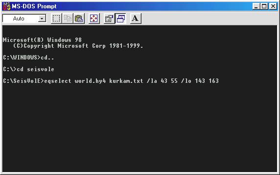
An additional example of an Event plot is given below in which we extract some data from the SeisVolE earthquake catalog using an auxiliary, DOS program that is included in the SEISVOLE folder. The earthquake data that we’ll select are events in the Kurile Islands and Kamchatka peninsula area. This region is very seismically and volcanically active. The location of the area is: latitude 43 – 55 degrees North, 143 – 163 degrees East. Our objective is to extract the shallow earthquake information (date, time, latitude, longitude, depth, magnitude) and examine the occurrence of these events through time using the Event plot. The event information will be placed in a text file (and eventually in an Excel spread sheet) that we’ll call kurkam.txt.
a. Open a DOS Prompt (you may have a shortcut on your desktop, or go to the Start menu, lower left hand corner of the screen; go to Programs and then select the DOS Prompt (Command Prompt in Windows 2000) with the cursor). A window will appear that probably includes the line C:WINDOWS> with the cursor to the right of the >. Type CD.. and return (Enter; to get to C:) and then CD seisvole and return, to access the SEISVOLE folder. Type eqselect world.hy4 kurkam.txt /la 43 55 /lo 143 163 and hit return (enter; eqselect is a DOS program that is able to search the earthquake data file to select certain events; world.hy4 is the earthquake catalog in SeisVolE; kurkam.txt is the name we’ve chosen for the output earthquake data in text format; the latitude (la) range of our selected area is 43 – 55 degrees [use negative numbers for South latitudes; be sure that the first latitude is the smallest, most negative in the case of South latitudes]; and the longitude (lo) range of our selected area is 143 – 163 degrees [use negative numbers for West longitudes; be sure that the first longitude is the smallest, most negative in the case of West longitudes]). Because we’ve not specified a time range, all data (through March 31, 2001 – the most recent date of updating our earthquake catalog) in the catalog within the area defined by the latitude and longitude limits (and of magnitude greater than or equal to 5 – the magnitude cutoff within the catalog) are selected resulting in 3102 events. The SeisVolE DOS program eqselect (see Help file, Miscellaneous, Auxillary DOS Programs for more information) will display some summary information about the data that have been extracted from the world.hy4 catalog. These data will be saved in the SEISVOLE folder under the file name kurkam.txt (or whatever file name that you have used). Type exit to exit the DOS window. A view of the DOS window with the commands described above (before the enter on the eqselect command) is shown below.
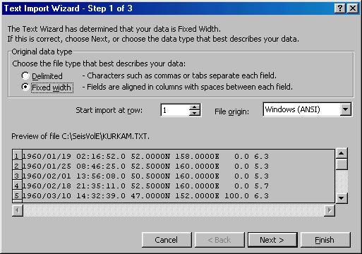
b. To import the kurkam.txt file into Excel so that we can further sort it and display the earthquake data in an Event plot, first, open Excel. Click on the Data menu, highlight Get External Data, and click on Import Text File…. In the dialog box that appears, navigate until you have opened the SEISVOLE folder, and open the kurkam.txt file. A dialog box (Text Import Wizard – Step 1 of 3, as shown below) will appear. Be sure that the button next to Fixed width in the Original data type box is checked (as shown below). The Preview at the bottom of the dialog box shows what the kurkam.txt text data file looks like. Click Next.
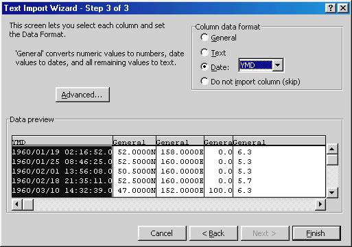
The Text Import Wizard – Step 2 of 3 dialog box (shown below) will appear. In order to place the date and time of day values in the same column, double click on the line below column 10. Then, click Next to open the Text Import Wizard – Step 3 of 3 dialog box (shown below). The first column (containing both the date and time of day data) will be highlighted. In the Column data format box in the upper right hand corner of the dialog box, select the Date and YMD (Year – Month – Day) format as shown in the image below, then click Finish. An Import Data dialog box will appear. Click OK.
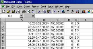
Make the width of column A larger by placing the mouse cursor on the vertical line between the A and B column headings and dragging the double arrows to the right. The Excel spreadsheet will then look like:
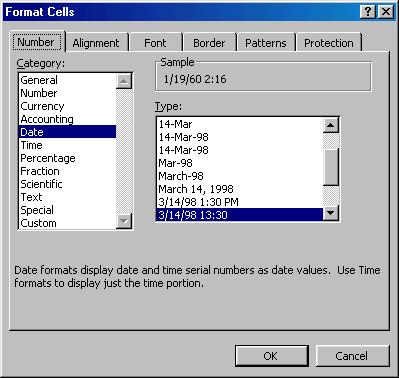
Highlight column A (click on the A at the top of the column). Click on the Format menu and then click on Cells. A dialog box will appear. Select Date in the Category box and the 3/14/98 13:30 format in the Type box. The dialog box will look like the following:
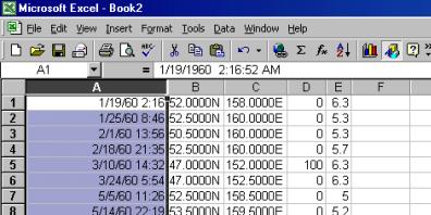
The Excel spreadsheet will then look like:
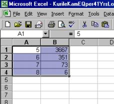
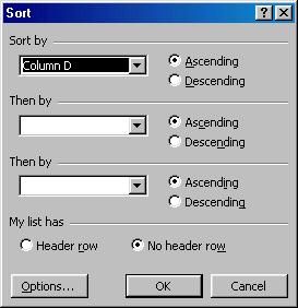
c. Now, in order to select only the shallow earthquakes, we want to sort the events by depth and eliminate the earthquakes from our file that have depths greater than 70 km. The depth information is in column D. To perform the sort, highlight columns A through E (drag the cursor along the A – E column headings above the data). Then click on the Data menu and click on Sort. Select Column D and Ascending in the Sort by section of the dialog box as shown below and click OK.
Near the bottom of the spreadsheet, find the last event that has a depth of 70 km. Highlight all of the rows (drag the “plus sign” cursor over the row numbers to the left of the data) below this event and Delete (Delete key). Be sure to save your shallow earthquake event file as an Excel file (.xls) using the Save As command. A useful name would be kurkam.xls.
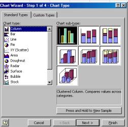
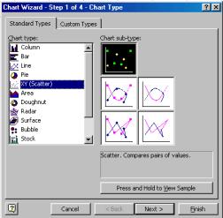
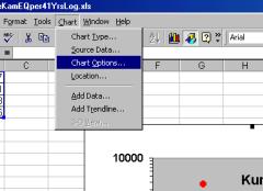
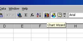
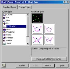
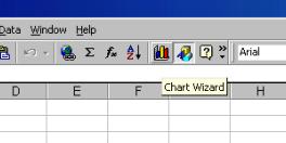
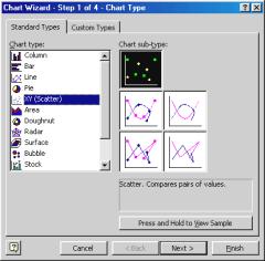
d. To make an Event plot of the Kuriles and Kamchatka data, open the kurkam.xls file in Excel and select columns A and E (only) by holding down the control (Ctrl) key and clicking on the column headings A(date and time) and E magnitude) above the data with the cursor (large plus sign). Click on the Chart Wizard and select the XY Scatter plot, as shown below:
|
|
|
Click Next, a preview will appear (below).
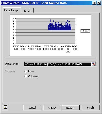
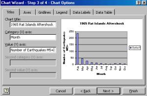
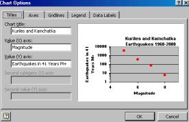
Click Next and enter the Title, X-axis and Y-axis labels in the dialog box. Click Next and then Finish. The resulting graph should look like the graph in Figure 19.9.
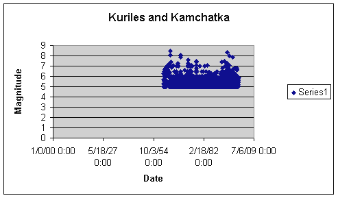
Figure 19.9. Preview of the Kuriles and Kamchatka Event plot.
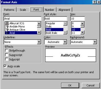
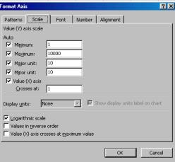
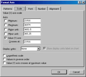
Select the graph (click in the rectangle that surrounds the graph) and drag the small, black squares to enlarge the graph area. Then, from the Chart menu, click on Chart Options… and turn off the legend and modify the graph title and axis labels as desired. Next, double click on the X axis and a Format Axis dialog box will appear. Select the Scale tab and enter the following numbers adjacent to the axis scale properties:
Minimum: 21916
Maximum: 36974
Major unit: 3652.5
Minor unit: 365.25
These entries set the minimum and maximum limits for the X axis and the tick mark spacing. Using these values, the major tic marks are spaced about 10 years apart and the minor tic marks each represent one year. The first value is the number of days after January 1, 1900 and corresponds to January 1, 1960. The second value corresponds to December 31, 2000. Next, select the Number tab and select Date from the Category list and the 3/14/98 format from the Type list. These entries cause only the date to be displayed to label the X axis. The format axis dialog box and entries described here are illustrated below.
|
|
|
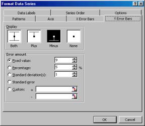
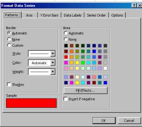
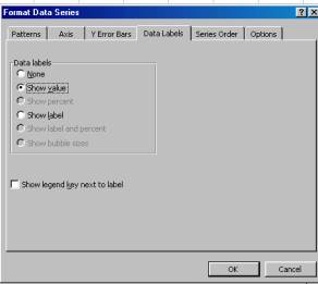
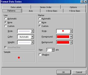
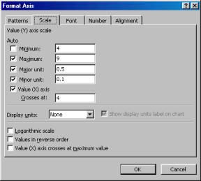
To format the Y (magnitude) axis, double click on the Y axis and enter 4 as the Minimum value for the axis, as shown below. Next, double click on one of the data points in the graph and a Format Data Series dialog box (below) will appear. Select the Y Error Bars tab and enter 9 as the Fixed value. This selection causes a vertical line to be drawn downward from each data point to the X axis and emphasizes the distinct event aspect of our data and the time location of each event.
|
|
|

The final result is illustrated in Figure 19.10. Notice that the events are not equally spaced in time. For example, during the 41 year time period shown in Figure 19.10, there were 33 shallow (<70 km depth) magnitude 7 or larger events (the earthquake catalog shows 49 events, but 16 of them are duplicates; the duplicate events occur in the list because large earthquakes often have more than one magnitude assigned to them or are re-located by later analysis; the duplicates are relatively easy to recognize in the list in the Excel spreadsheet because they will usually have the same origin time and latitude and longitude of the epicenter). Thirty-three events in 41 years suggest an average interval between M7+ earthquakes of about 15 months. However, the M7+ earthquakes are very unevenly spaced. The time interval between events varies from less than one day (an M7.1 and an M7.4 earthquake on March 23, 1978) to over 7 years (from March 24, 1984 to December 22, 1991).
 Figure
19.10. Event plot for the Kuriles and
Kamchatka earthquakes. Data are
shallow-focus (<70 km depth) earthquakes from 1960 – 2000, M5+ from the
Kuriles and Kamchatka area (latitude range 43 – 55 degrees N, longitude 143 –
163 degrees E). Major tic marks on the
Date axis are about 10 years apart.
Minor tic marks on the Date axis are about 1 year apart.
Figure
19.10. Event plot for the Kuriles and
Kamchatka earthquakes. Data are
shallow-focus (<70 km depth) earthquakes from 1960 – 2000, M5+ from the
Kuriles and Kamchatka area (latitude range 43 – 55 degrees N, longitude 143 –
163 degrees E). Major tic marks on the
Date axis are about 10 years apart.
Minor tic marks on the Date axis are about 1 year apart.
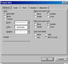
Many of the shallow earthquakes in the Kuriles and Kamchatkas (and in other areas) occur in main shock/aftershock sequences. When a large earthquake (a main shock) occurs, the event is often followed by many, usually smaller earthquakes (aftershocks) that occur in the same general area. We can view main shock/aftershock sequences with the event plot by “zooming in” (Figure 19.11) by double clicking on the Date axis and entering 35547 for the minimum date and 36000 for the maximum date in the Format Axis dialog box under the Scale tab. Now we can see about 5 large earthquakes (main shocks) that are followed by several M5+ aftershocks. We could verify that most of the events after the main shocks are actually aftershocks by checking the locations (not too distant from the main shock location) of the earthquakes in the Excel earthquake list or by creating views (controlling the latitude and longitude range and range of dates) in SeisVolE.
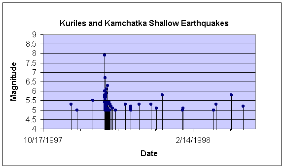
Figure 19.11.
Event plot for the Kuriles and Kamchatka earthquakes. Data are shallow-focus (<70 km depth)
earthquakes from August, 1994 – August, 1998, M5+ from the Kuriles and
Kamchatka area (latitude range 43 – 55 degrees N, longitude 143 – 163 degrees
E). Major tic marks on the Date axis
are about 1 year apart. Minor tic marks
on the Date axis are about 1 month apart.
We can zoom in further by setting the minimum and maximum days in the Format Axis, Scale dialog box to 35720 and 35890, respectively. The resulting Event plot is shown in Figure 19.12. The events immediately after the December 5, 1997 M7.9 earthquake are aftershocks of this main shock.
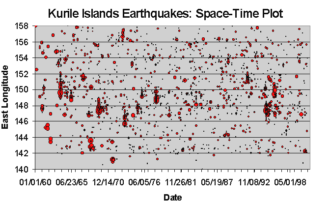
Figure 19.12.
Event plot for the Kuriles and Kamchatka earthquakes. Data are shallow-focus (<70 km depth)
earthquakes from October, 1997 – March, 1998, M5+ from the Kuriles and
Kamchatka area (latitude range 43 – 55 degrees N, longitude 143 – 163 degrees
E). Major tic marks on the Date axis
are 120 days apart. Minor tic marks on
the Date axis are 30 days apart.
4. Space – Time (Bubble) Plot: (This section under development, 1/11/02)

Go to List of SeisVole Teaching Modules (in Introduction to SeisVolE Teaching…; Module 0)