Slide 7 of 24
Notes:
When initially instructed to color the maps, the respondents were given the following directions: “Now I am going to give you a map of LA and some colored pencils. 1. I want you to mark your neighborhood in black first. 2. Then put green circles around the areas you know well and where you feel comfortable. Put yellow circles around places you do not know as well but go to at least occasionally and feel reasonably secure. Put red circles around areas where you feel uncomfortable, regardless of how well you know the area. Finally, put blue circles around areas which you just don't know. 3. Now color your area, using appropriate colors” (Focus Group Protocol).
Although the protocol refers to circles, in fact moderators varied in their instructions, most of them asking the respondents to color in areas the felt comfortable or uncomfortable, according to the color scheme.
Redrawing the maps in ArcView involved two different operations: creating shape files and adding fields to attribute tables.
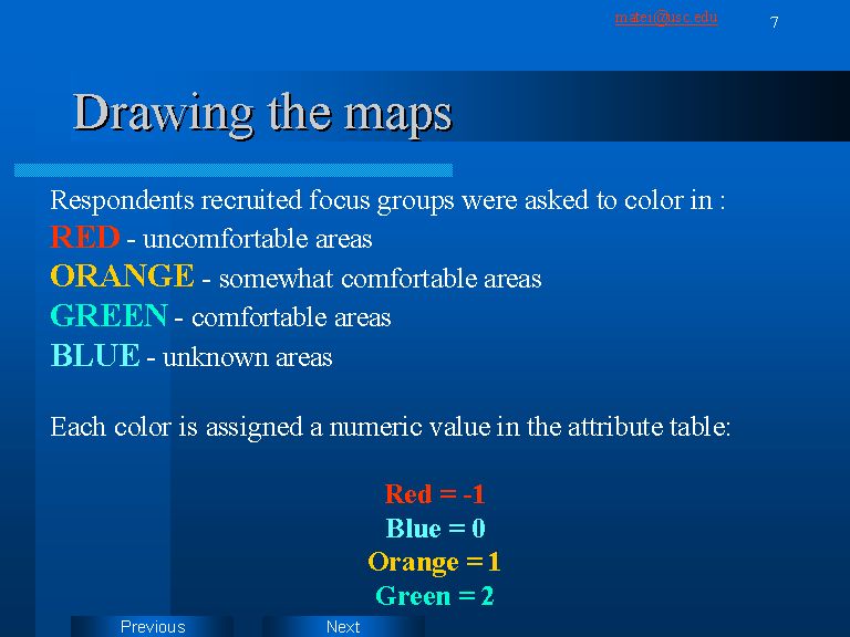
ArcView vector maps are composed of a shapefile, georeferencing the the polygons representing a specific area and a database file (dbf), which associates to each polygon (feature) attribute data. In our case, each specific area on the map was assigned a comfort attribute value. The color scheme is translated into integer values. We have assumed that uncomfortable areas go in the opposite direction from those defined as comfortable. Thus, the negative value for uncomfort.
We are aware of the fact that the scale is not perfect, having a bias toward positive values. Ideally, the respondents should have given a five category color scheme, with a neutral point. Also, we should should have defined unknown areas as missing values.