Slide 18 of 24
Notes:
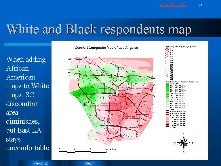
In slide 18 I have combined the average maps of both White areas with that of Crenshaw respondents. Remarkably, Compton, Watts, and a part of South Central appear now as uncomfortable. This means that the high score of the Crenshaw respondents were not enough to completely balance the negative scores of the White respondents. Also, the East-West divide becomes very clear. As I will show later, this map is almost identical with the “grand total” map of Los Angeles, averaged from all 4 area maps.