Slide 22 of 24
Notes:
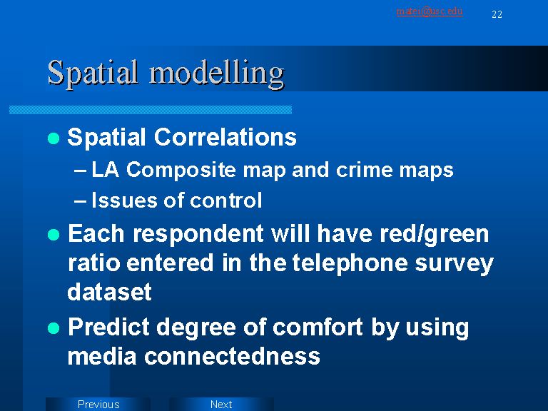
Many of the inferences presented above are quite subjective. They are educated guesses, following the direction in which the distribution of the colors seems to pan out on the map or in the charts. However, by employing the newly released S-Plus statistical package for ArcView one can measure the degree of association between various maps. The next natural step in this research will be to compare the maps by running correlations on their attribute table values. An alternative way to analyze the data is by entering the red/green area ratios for each individual map in the dataset resulted from the telephone interview. This would allow running more sophisticated analyses. They can reveal the causal paths leading to the degree of comfort or discomfort one feels in Los Angeles. A natural candidate for causal elements would be amount of media connectedness. This can be further refined breaking down the media into mainstream and local outlets, or print vs. tv vs. internet connectedness.