

Elena Cadenas


2017 Purdue University SROP Program for Undergraduates
Data Visualization Summer Research Experience
The Pennsylvania State University
Schreyer Honors CollegeState College, Pennsylvania
ecc5222@psu.edu
Visualization Mentor
Dr. Vetria ByrdComputer Graphics Technology
Research Mentor
Dr. Harm HogenEschVeterinary Medicine and Comparitive Pathobiology
About Me
Hi! My name is Elena Cadenas and I am an undergraduate student at the Pennsylvania State University Schreyer Honors College. I am also a Bunton-Waller Fellow, Women in Math Scholar, and in Phi Eta Sigma National Honor Society and the National Society for Leadership and Success. I am currently a Math major with a Biology minor on the pre-medicine track. I aspire to be a pediatrician. I love working with kids and I have always wanted to be a part of the medical field helping others, so I figured why not have the best of both worlds? I went to Honduras with an organization at Penn State called Global Medical Brigades to explore if medicine is my passion. I was not surprised when I was loving every second of my time there. Due to my interest in health, I conduct research at Penn State on the Combinatorial Threshold-Linear Networks of neural networks. Last summer I shadowed Dr. Maria Pace at INOVA Hospital in the Radiology department. This summer I am participating in the Summer Research Opportunities Program at Purdue University. I am working with Dr. Byrd and Dr. HogenEsch researching and creating visualizations about the genetics of immune response to Pertussis. This site will contain updates on the current research I am doing for the SROP.
Project Description
This summer I am doing a two part lab. The first part of my project is working with Dr. Byrd in a Data visualization lab. My goal is to learn new techniques for data visualization and get experience with various tools. The visualizations I am creating are for the lab work of Dr. Harm HogenEsch. He has already collected the data for the experiment on the genetics of the immune response of inbred mice strains, which are either high or low responders, to Pertussis. One goal was to identify genes that are differentially expressed after the vaccination with the DTaP vaccine. They also wanted to identify genes that are only differentially expressed in either high or low responders and see how these genes are related and what biological processes they impact. I will be creating multiple visualizations to best display this data including the following: heat maps, volcano plots, networks of biological pathways, circle plots, and principal component analyses.
Visualization Tools
Visualization Tools (under review)
Cytoscape.
Cytoscape is an open source software platform for visualizing molecular interaction networks and biological pathways
and integrating these networks with annotations, gene expression profiles and other state data.
I am considering using this tool for creating heat maps, biological networks, and principal component analyses.
http://www.cytoscape.org/
Metascape.
Metascape provides automated meta-analysis tools to understand either common or unique pathways and
protein networks within a group of orthogonal target-discovery studies. I will be using this tool to create heat maps of
the individual mice strains and for circle plots. I may possibly use it for cluster graphs too.
http://metascape.org/gp/index.html#/main/step1
LocusZoom visually displays regional information such as the strength and extent of the association signal relative to genomic position, local linkage disequilibrium (LD) and recombination patterns and the positions of genes in the region. I will be using this to create volcano plots of the genomic data. http://locuszoom.sph.umich.edu/genform.php?type=yourdata
Week 1
As many first weeks, we did many introductory and administrative tasks.
We did CITI training to be able to work in the lab. We also watched a TED talk by Rosling and read
many intro to visualization papers.
One of the assignments we did was answering questions on a published paper in our research field.
I chose the paper that Yung-Yi and Dr. HogenEsch recently published before I joined their lab titled,
Genome-wide Association Mapping of the Antibody Response to Diphtheria, Tetanus and Acellular Pertussis Vaccine in Mice.
[1] What types of visualizations were used?
Scatter plots with lines of best fit, bar graphs with error bars, venn diagrams, and manhattan plots.
[2] Review the slides from the Introduction to Data Visualization Talk given earlier this week, specifically the slide titled, “You’ve Got Data Now What?” take a look at the URL under point #5: Where do I start? For the visualizations that are in the paper you selected, where do they fit in the diagram found at the URL? What do they show? Consider this a starting point.
Comparison, relationship, and distribution.
[3] What does the data look like (describe to someone who hasn’t seen it)?
It looks like there is a correlation between the majorities of the data, but some data sets have varied results
Heterogeneous data- is it a text file or image or geo or spatial.
[4] What is being communicated?
Magnitude of IgG responses, longevity, and avidity to the different vaccine antigens in the various mice strains; SNPs associated with antibody longevity; numbers of genes associated with magnitude, longevity and avidity; the expression of genes related to longevity by quantitative reverse transcription PCR.
[5] What are the authors interested in utilizing the visualizations for?
Informing the audience and seeing if their data has a correlation and is what they expected.
Week 2
Week two started with a meeting with me and both of my mentors. This was to discuss milestones for me
and to talk about what types of visualizations Dr. HogenEsch wants me to create. Dr. Byrd gave everyone in my lab a presentation on
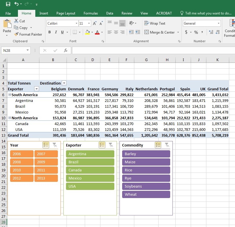
data visualization. She also introduced us to HTML. I worked on many exercises on Pivot Tables and Pivot Charts in Excel. I did a literature review
and created a table with various visualization tools that I found in published papers that can be used to create different graphs for Biological data.
I ran into some trouble with Cytoscape on my computer, but I used some of the other tools I found to start
a few of my visualizations for Dr. HogenEsch such as heat maps, circle plots, and cluster maps. On Friday my lab group toured the Envision Center on campus.
It was very interesting and cool to see the different technology that can be used to create advanced visualizations. We got to use virtual reality equipment and
a holographic headset. I had never seen a holographic headset before, so it was very exciting. I really enjoyed the tour and being able to see the possibility
of the technology I could be working with if I go to graduate school here at Purdue.
Week 3
Goal: Create a heat map for the data and figure out how to use Cytoscape.
This week I was focusing on figuring out how to work Cytoscape. I could not find a tutorial on the format
that the data should be as input for the network, but after a lot of trial and error I finally figured it out. I am happy to
say that I made a successful heat map and made it in various color schemes. I also had a lab meeting this week and I was able to listen
to some of the Graduate students and Post-Docs talk about the research they are conducting in the lab. I have seen many of them around the
lab, so it was nice to find out about what they are working on. Some of the figures I have made thus far were used in the presentation by the Post-Doc I am working with, Yung-Yi Mosley,
so that was exciting. This week I also discovered a few other tools that I can use to create various visualizations.
Week 4
Project Goals:
1. Finish all of the figures that Dr. HogenEsch and Yung-Yi want for their data.
2. Have a better understanding on the different types of visualizations that can be made.
3. Learn how to perform ELISA.
This week Dr. Byrd is at a conference, so we did not have our normal weekly meetings; however, we did Skype with her on Thursday.
We were assigned three articles to read listed as follows: Heer, J., Bostock, M., & Ogievetsky, V. (2010). A tour through the visualization zoo. Queue, 8(5), 20.;
Rogowitz, B. E., Treinish, L. A., & Bryson, S. (1996). How not to lie with visualization. Computers in Physics, 10(3), 268-273.; and
How to write an abstract.
The first article is on the benefits of visualizations and how they can be exotic, which attracts a larger audience.
They discuss different forms of visualizations and the types of data that they can represent. The second article discusses how the format of
a visualization can change the viewer's interpretation of the information. They demonstrate how the creator of the visualization
makes many decisions that can impact how the information comes across to the viewer, which can be based on the principles of
human perception, attention, and color theory. It also discusses being aware of fallacies that can come from visualizations and how to avoid
them when creating visualizations yourself. The last article gave tips on writing an abstract. It included a helpful checklist and various considerations
to keep in mind when writing an abstract.
I had a meeting with Dr. HogenEsch to discuss some details of the visualizations that he wants me to make.
I made two network clusters for the naive and vaccinated mice. I also made a circle plot for the vaccinated mice strains to show the overlapping genes between the strains.
I had my journal club presentation this week, so I presented the paper that Yung-Yi and Dr. HogenEsch published that is the on the research they conducted in which the research I am doing is a follow-up experiment.
My presentation went very well. I have been looking for a software to use to create my volcano plots. So far I have found two that look interesting, but now I have to wait for them to be downloaded onto the computer in my lab to see which one will work the best for me.
This Friday will be my first time performing ELISA in the lab with Yung-Yi.
Week 5
This week we had Tuesday off for the Fourth of July. When we came back to work on Wednesday, we had an introduction to Tableau. I made a volcano plot using this software.
We also had an introduction to D3; however, I have not created any visualizations using this Javascript library.
I read to more papers on visualization. One of them we have read before named, " A tour through the visualization zoo," but this time we took a look at the interactive version.
I liked it a lot because I could click on the different types of visualizations and see them move and how they have an interactive component to them.
The other paper is titled, "7 Classic Foundational Vis Papers You Might not Want to Publicly Confess you Don’t Know," which is by a blogger and professor at NYU, Enrico Bertini.
He mentions a few research papers on visualization, what they discuss, why they are important, and what you can learn from each of them.
The papers all introduce different types and aspects of visualizations as well as techniques you can use to make effectvie visualizations.
One of the papers he mentioned particular caught my eye because it was written by one of the creators of the software Tableau, which I am using for my visualizations.
In his paper he describes multiple graphical representations for different types of data sets and how they can be used effectively, so that the creator does not present the data in a way
that the viewers can misinterpret the data. I found a new visualization tool called OriginLab that has an application for volcano plots, which I got the Tech crew to download on
my lab computer. Now I have a new software to learn so that I can make my volcano plots. I found a way to make volcano plots on Tableau, but I cannot figure out how to
color code the data in respect to the p-values since the p-values are not part of the data that is plotted and Tableau does not have an application specifically for volcano plots.
I was not familiar with volcano plots before I was introduced to them here. I did some research on their meaning and found that they show the most meaningful changes in the data.
It is a plot showing the amount of gene expression (log2foldchange) on the x-axis versus the statistical significance of the data (the negative log10 of the p-value) on the y-axis.
The log of the values are taken so that changes in both directions will appear equidistant from the center on the graph.
A p-value less than 0.05 means that that you can reject the null hypothesis for that data point, or in other words it means that that data point is statistically significant.
On the plot, the data points that have a p-value less than 0.05 are presented in a different color because without this different coloration you would not be able to tell which points have
a p-value that is statistically significant. In the attached volcano plot, the statistically significant points are colored in blue and the points that are not statistically significant
are colored in grey. It is also common to label the top ten genes. The top ten genes are determined based on statistical significance and a large magnitude for log10foldchange (the amount of gene expression).
These points are normally far to either side of the graph and close to the top.

I accomplished all of my goals from last week except for the first one because I am still not done creating all of my visualizations; however, I did create three new visualizations this week. I am keeping the same goals as last week because I have performed ELISA twice now, but I still have never done it fully on my own. Also, there is always room for development and I would like to continue to gain a better understanding on not only the visualizations I have made, but also the ones that I still need to create.
Week 6
To start off the week I had a meeting with Dr. Byrd, Dr. HogenEsch, and Yung-Yi.
They decided that they wanted to go in a different direction with the visualizations using different data
for the circle plots and Venn diagrams. I received the individual mice data so that I could make the correct heat maps.
I made two heat maps, one with the FPKM values and one with the TPM values. I also added a clustering effect to the heat maps where I
clustered the genes together. I made the new Venn diagram and circle plots based off of the data that had a significant p-value (less than or equal to 0.05)
and a log2 fold change greater than 1 and less than -1. I made tables for the top 10 upregulated and downregulated genes for each strain based off of the
significant p-value and the largest/smallest log2 fold change. I could not figure out how to label these genes on the volcano plots. I have tried looking
for a user's guide and tutorials, but I have had no luck. I still need to find a software to make the network clusters with because as of right now the
network clusters I have made are not organized by gene functionality, only the strain/s the genes are expressed in. This Friday our abstracts are due for
the program, so I have also been busy writing that and starting making the Power Point for my final presentation.
After having another meeting with Dr. HogenEsch and Yung-Yi, I needed to make adjustments to my visualizations.
I finally figured out how to label the top ten up and down regulated genes on the volcano plots. I made three heat
maps, one for each strain being the standard of the top 100 genes to choose by taking the average of the different mice
for the standard strain and then determining the top 100 DEGs. For the heat maps, I also clustered the mice samples and the genes
hierarchically. I made a new Venn diagram for the average TPM values of individual mice and chose the top 100 genes for each strain. I had
to fix the previous Venn diagram I made to contain DEGs with a p-value less than 0.05 and the log2 fold change less than or equal to -1 and
greater than or equal to 1. Along with these Venn diagrams, I made circle plots with this data.
Week 7
TThis week is the last week of performing research. On Monday, I presented what I have so far for my final presentation. It went well and I got good feedback from Dr. Byrd and the other two professors that sat in to listen. I made their recommended adjustments to my Power Point. I also started my poster and I will continue to work on it for duration of the week. I fixed the format of my data in a new Excel sheet so that it is in the correct format to make a network. I have tried making a network with Cytoscape, Gephi and OriginLab; however, I still have not been successful in finding a tool that will group the data in both strain type and gene function. I am experimenting with Cytoscape and using DAVID as a tool to filter the genes by function. I have made a few networks. First, I made one where I used the top 10 statistically significant up and down regulated genes from each strain. Wanting to make the visualization contain more data, I increased this to the top 20 statistically significant up and down regulated genes from each strain. Using the results from my Venn diagram, I then made a network with the 114 DEGs shared by all three strains to show the networks induced by vaccination with Cytoscape. Yung-Yi and Dr. HogenEsch also want me to create figures with the 33 DEGs shared by BC and 129 with the 222 DEGs only present in LPJ (one figure containing the upregulated genes and the other containing the downregulated). I was able to make all of the networks with the gene functions that they wanted.
Week 8
This is our last week of the program. I finished making my poster and editing my Power Point for the final presentation and poster presentation this week. I also made one more network with the 33 DEGs between BC and 129 to put on my poster and Power Point. I gave Yung-Yi a tutorial on all of the softwares that I used to make the visualizations and the different formats that the Excel sheets should be in.
Last updated: 07/25/2017