Slide 11 of 24
Notes:
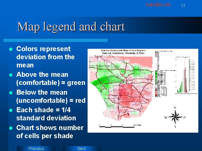
As mentioned above, average map colors do not represent raw scores. They are z-scores, representing variation of each cell, in either direction, from the mean.
Charts are useful for assessing normality of color distribution. Especially interesting are skewed distributions, which tell us if people in a certain area are on the average more likely to feel uncomfortable or comfortable in Los Angeles as a whole.