Slide 13 of 24
Notes:
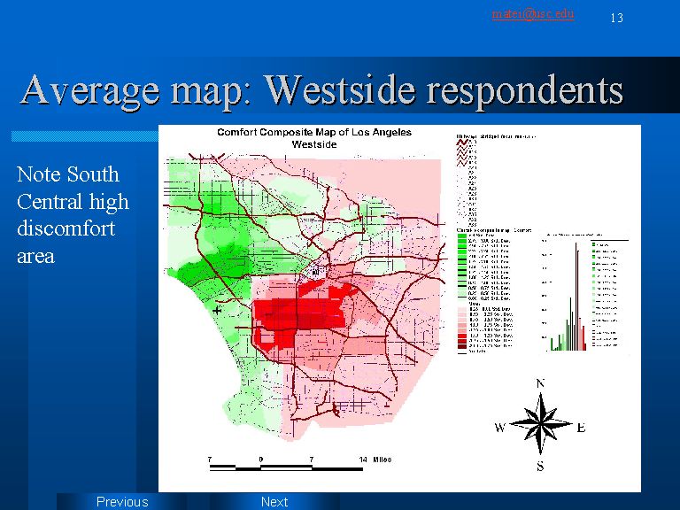
The map above (slide 13) represents areas of comfort/discomfort for the 12 Westside residents included in the sample. This is one of the most polarized maps. The red values, of all the other individual group maps, are the furthest away from the mean. However, as indicated in the chart, the number of really extreme negative scores is low. The legend tells us that they do not go over 2 standard deviations. Yet, the dark red spot in the Compton area will have a great influence in shaping the “grand total” map, contributing decisively to making this the most uncomfortable area of Los Angeles. Interesting to note is the fact that the curve of score distribution, although skewed to the right, indicates a spike at the green extremity, strengthening the feeling of polarization.